


medical report page
team
IBM
Project Manager
Senior UX/UI Designer
UX/UI Designer
Full Stack Developer
Innocens
Neonatal Doctors (2x)
Full Stack Developer
My role
UX Design
UI Design
Data visualization
Skills & Tools for this project
data visualization
IBM Carbon
user friendly interface
machine learning
medical
dashboard
design sprints
Figma

Mural
Introduction
In the neonatal intensive care unit (NICU), the clinicians must have an eye on possible health concerns for preterm infants. One in five (under 1,500 grams) develops sepsis that needs to be treated with antibiotics. The changes in the baby’s vital signs often appear to be visible up to several hours before sepsis detection, and the sooner the treatment is administered, the better the outcome for the patient.
That's where Dr. David Van Laere, a neonatologist at Antwerp University Hospital (UZA) and founder of Innocens, saw the possibility to use AI to support the clinical staff with their decisions. Using monitoring signals and data from the patient’s electronic file, the team from Innocens, together with IBM, developed a solution showing the current risk for every newborn and recommended actions. Read more here.
The next iteration for the project was tweaking the main dashboard, adding new labels to the data, and building a report page for sepsis overview reports. The last part was my focus area.
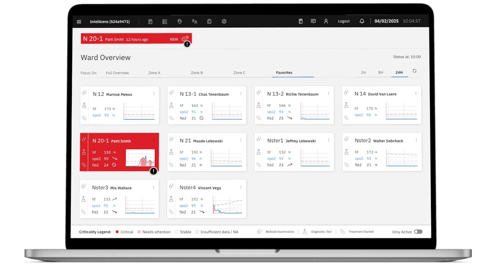
Step one was research into neonatal care & the existing screens. The main screen is the dashboard that shows cards for every newborn in the NICU with vital signs and a prominent ranking according to their criticality. As our Senior UX/UI Designer was responsible for the first iteration and the dashboard, she could lay out the functionality for me. Additional resources were the documentation of the project and papers, which were published by the doctors.
After this, we also had a get-to-know-you call with Dr. Van Laere and the team from Belgium. There, they lined out their needs for new features and what they should look like. In the following, I am going to focus on my part – the design of the report page.
problem statement
After the call, the problem was quite clear:
"We don’t have an easy way to see data and trends.
Is the application really leading to better outcomes for patients?"
The doctors also provided me with a list of featured charts and filter options they needed most.
Client brief
In short, this means:
5 different charts with two levels of filter options: time (year/month) and gestational age (adjustable range from 23 to 40+ weeks).
The first chart, showing only the number of admitted patients, is quite trivial, but the following ones show additional data like sepsis type. Without an intuitive visualization of the filter options and hover states, this could quickly get crowded and confusing.
first design
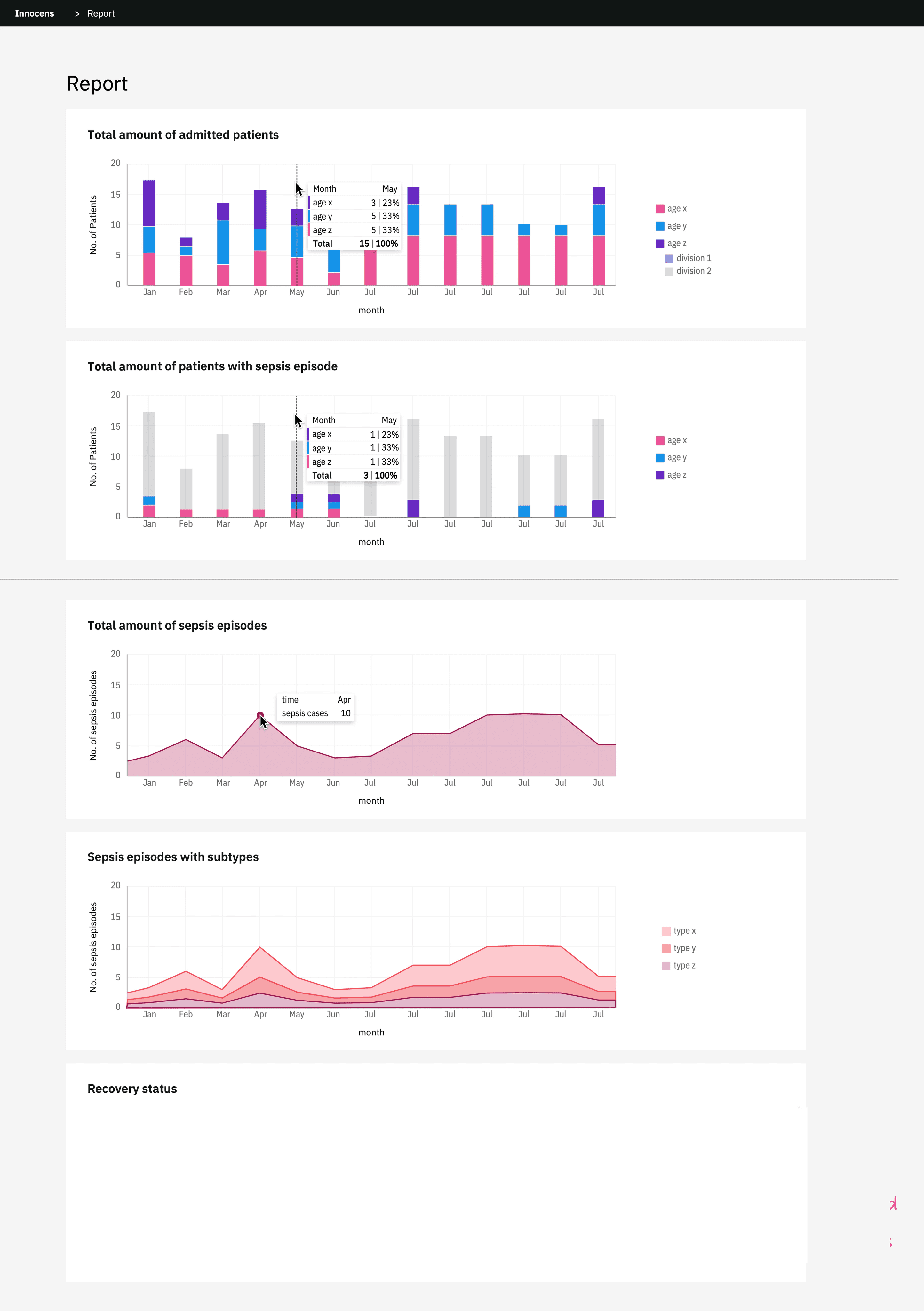
I began by researching all the medical terms I did not know, making a glossary, and writing down what clarification I needed to design the filter options (like granularity of age). Then I used IBM's data visualization tools from Carbon Design to create the first two charts.
For the "total amount of patients" and "amount with sepsis," I chose vertical stacked bar charts.
Stacked bar charts are useful for comparing proportional contributions within a category. This means that doctors can see at a glance how many patients from each age group were in the NICU that month.
Vertical alignment is a default pattern for timelines, and the stacked approach allowed for more data without an additional diagram or more clutter. For now, the default was set per month.
feedback session with doctors
Often, it's easier to know what exactly you want when there already is a visualization that you can tweak. With this in mind, I made the first versions of the charts. These were all possible to build with standard components from IBM Carbon, so we could keep the ambitious time frame of the project. The goal of the next meeting was to provide feedback on the first design and answer some of my open questions that came up in the meantime. We collaborated and documented decisions in Mural so everyone could add ideas and digital post-its.

refinement
With all the questions answered, I could get to work on the refinement.
Now we had two bar charts – one with the total amount of patients (filtered by age or birth weight) and the second one –a subset of the first– with the additional indicator sepsis/NEC/no sickness, in addition to the filter options age or birth weight.
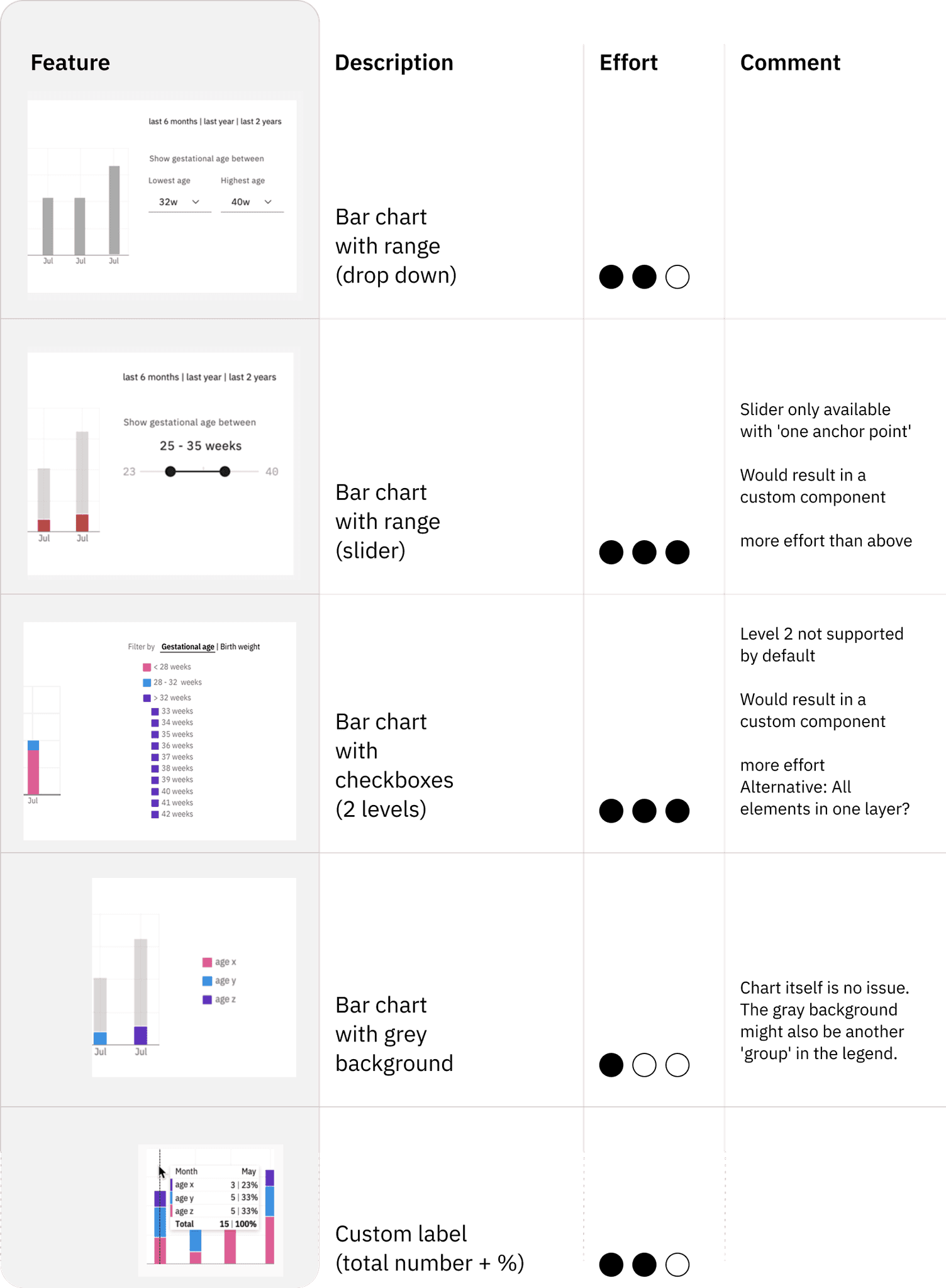
The doctors preferred having a more granular filter option for the age (possibility to,e.g., put in 24 – 26 weeks instead of three categories) and the option to choose between two filters (age or weight). As this was not supported in the standard components, I created a design with custom filter options.
Our FrontEnd Dev had reduced bandwidth, so we had to compromise. To get the best result with the least amount of effort, I made a list for her and the doctors where we could rank features by added value and additional effort.
After the estimation and a quick consultation with all parties I could take the results and design a version that was a reasonable effort for development and showed all necessary data for the doctors.
deliver
After one more session with all stakeholders, we decided on this final version.
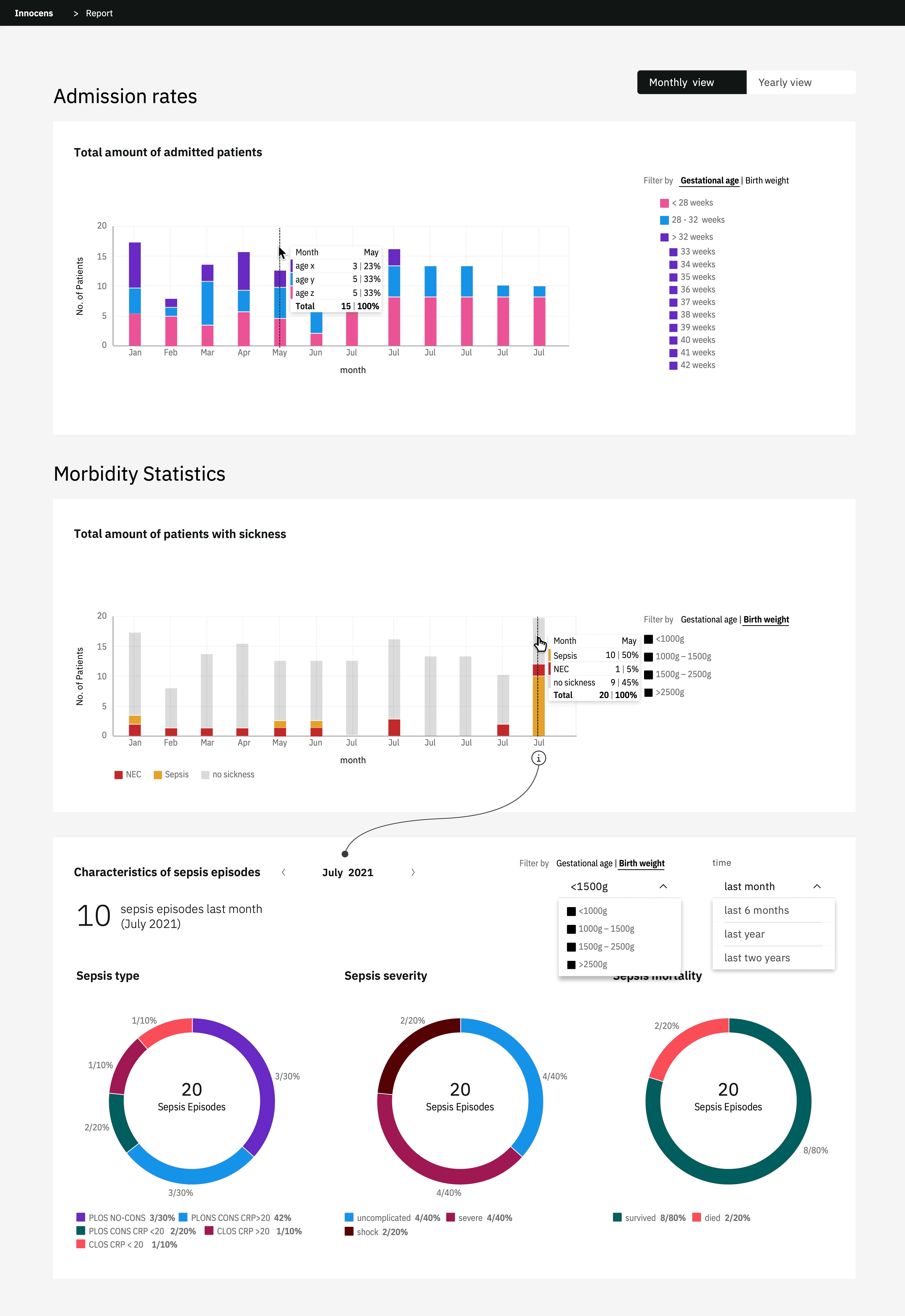
Admission rates
There are two filter options (gestational age and birth weight). We did not use a slider to filter, as it would have prolonged the development significantly. Instead, there is a longer list with weekly granularity that allows for more custom input filtering.
Morbidity statistics
We decided to remove the total amount of sepsis in favour of patients with sickness. This chart has the same filter options as the previous one and additional data (NEC/Sepsis/no sickness).
Sepsis episodes
Three pie charts show the sepsis types, severity, and mortality of the selected month. Here we also have the option to filter by age and weight.
With this setup, the doctors have all the necessary data at first glance, but are able to dig deeper if needed. They can evaluate if their current approach (and the AI model in the background) is working as intended. Communicating trends with non technical people also got way easier.
Epert users may prefer patterns, that seem unintuitive at first glance.